
Creating a Pop Art Portrait in Illustrator
Overview
This tutorial will take you through creating a pop art portrait in Adobe Illustrator (in the WPAP style) using a few simple tools & techniques to make the process fast and painless.
WPAP is a Cubist-inspired style of geometric pop art that has been lurking around the internet for quite a while. Popularized in the late 1990's by Indonesian artist Wedha Abdul Rasyid, Wedha's Pop Art Portraits or 'WPAP' for short, are easily recognizable by their sharp lines and wild, vibrant color schemes.
1. Choose Your Image
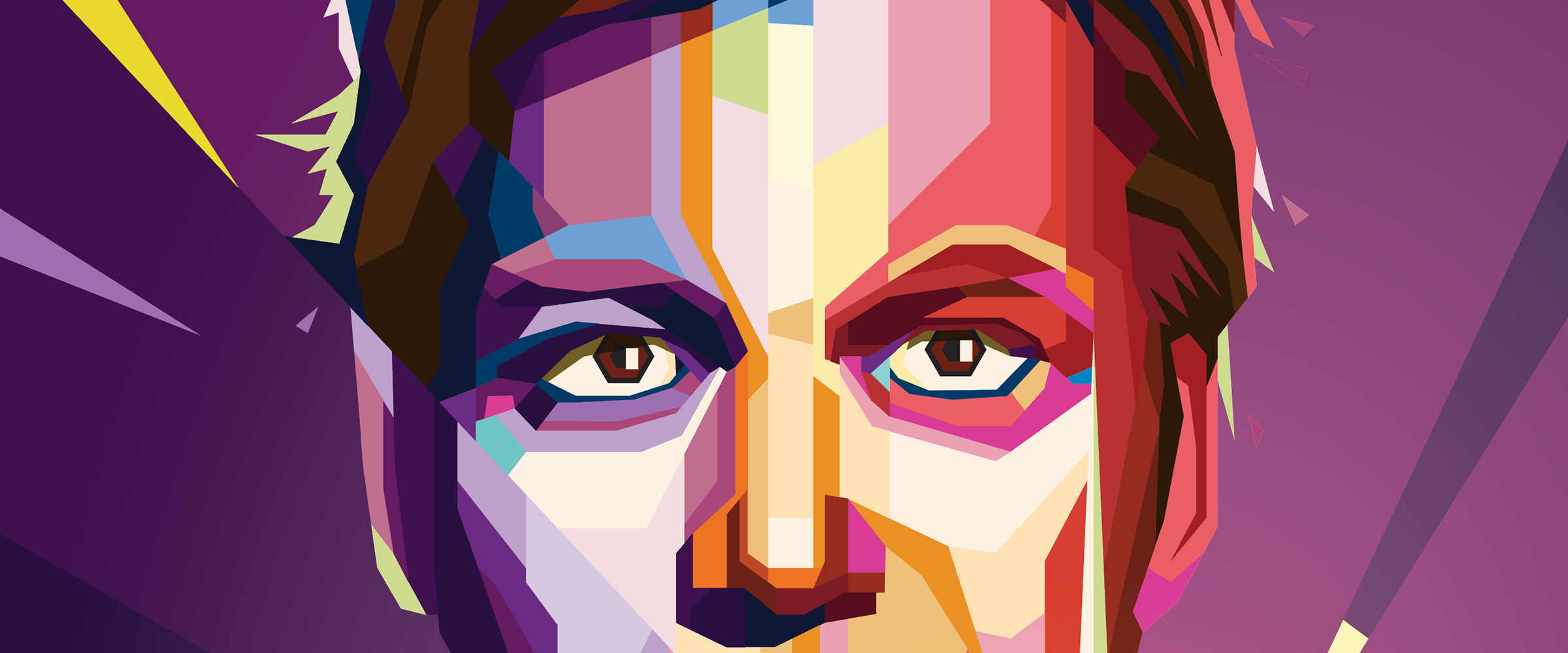
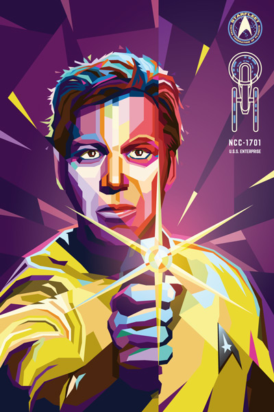
Select any portrait photo that tickles your fancy. The photo you choose should ideally have well-defined tones and clarity. Typically the stronger the contrast the more dramatic the finished piece. Let's use Captain Kirk for our example.

2. Set Up Your Document
Create a new Illustrator document with art board dimensions that suit your portrait. This will be a vector piece, so scaling up or down in the future will not be a problem.
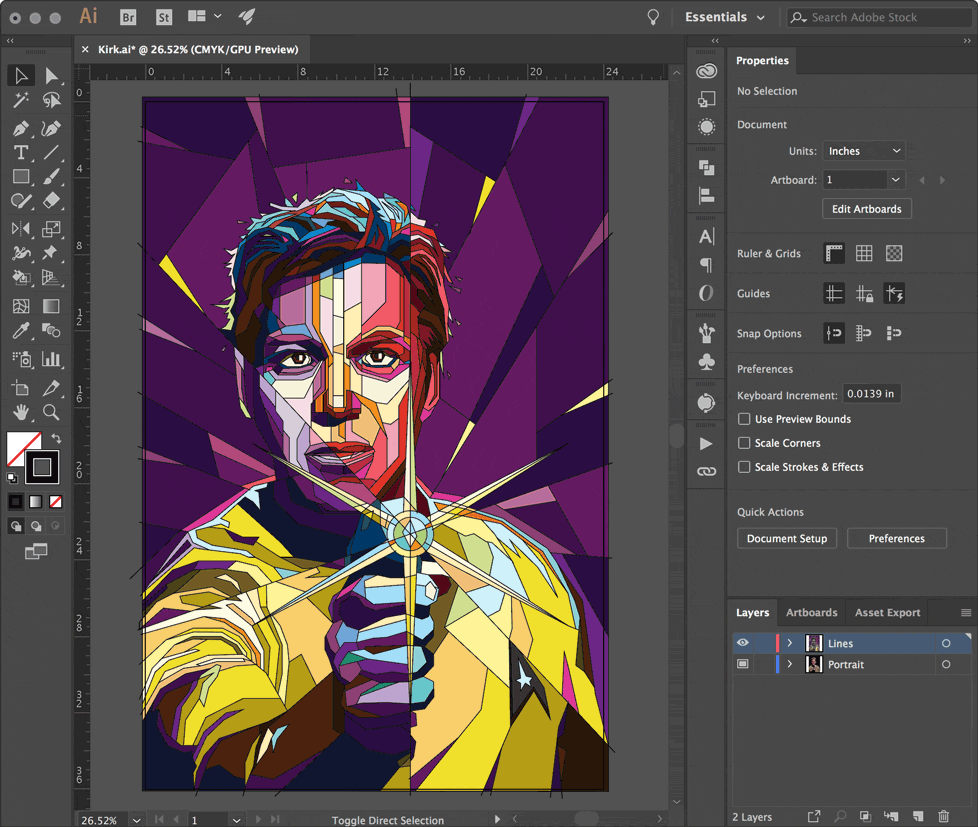
Place your photo onto the the only layer in the doc. Double click the layer and set it to a Template layer (the default Dim Images to 50% opacity is fine). Making this a template layer will be important later after you begin coloring, because it still allows you to see the photo when you use outline mode. Might as well name the layer "Portrait" (always name your layers 😉).


Make a New Layer on top of the portrait layer; this is where most of your art will happen. Draw a large empty rectangle with a 1pt border around the edges of the art board. This box will provide a handy border to contain the color regions once you begin. Turn Smart Guides on if they aren't already (Ctrl+U or ⌘+U) to help with precision when placing lines in the next step.

3. Draw a Bunch of Lines
WPAP line work is traditionally straight and not curved, so posterizing or live tracing is right out. Using straight lines to create structure, movement, and interest is the goal. There is no real shortcut to making the lines and geometry, and you wouldn't want to leave this creative decision to the robots anyway.
Using the Pen Tool, create 1pt lines to define all the regions where there is a change in tone. No need to worry about closed paths, shape layers, or overlapping objects — being messy is fine. Don't be afraid to create large lines that cross the entire composition, and use more detailed lines in areas such as the eyes, ears, and the mouth. Lines that reach the edge of the artboard should intersect or overlap the large rectangle border.

Eyes, ears, and usually lips will typically have more detail. The little light reflected in the eye is placed on a top layer at the very end (it's called a 'catchlight') and gives eyes a more lifelike appearance.

Notice how the phaser lines (shown in red) travel all the way to the edge, and the background has a fractured, shattered glass-like appearance. This should look great once we lay some colors down.
If you're feeling especially frisky, add background elements that cut into the composition; leading lines, simple shapes, spirals, large letters, etc. The additional lines and shapes will create an interesting foreground/background interaction. You can see how the rays of the phaser and the background create a burst pattern that intersects the image.

You can always adjust your lines later to balance things out or add more detail, even after coloring. Having too many lines is better than not enough because the extra regions can be filled with the same color.
This line-only method is a huge improvement over the widely used — and very tedious — 'draw a polygon, overlap and match with other shapes, fill with a color, layer it up or down, rinse and repeat...' method.
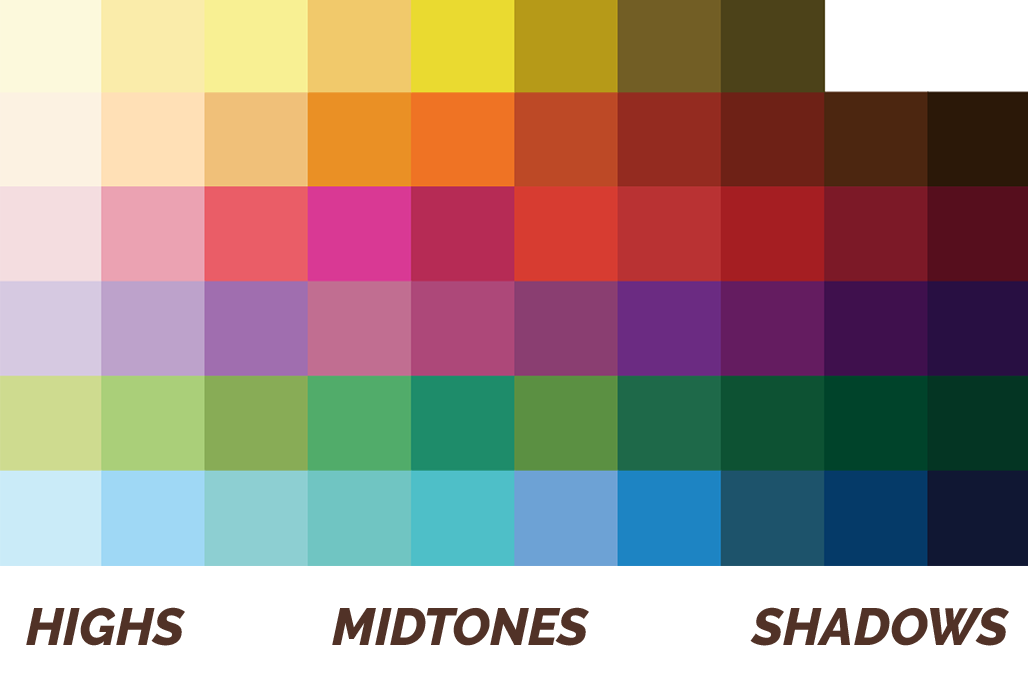
4. Create a Color Palette
All WPAP art shares a similar palette consisting of seven colors, each with about 10 tones. To begin, we'll create a ten-step grayscale palette.
Create 10 filled squares in a row, and starting with a very light gray (almost white) and fill each with progressively darker gray shades. The last color should be very dark gray (almost black).

They don't need to be perfect, they just need to be distinct from each other.
Do this for all the major colors: yellow, orange, red, purple, green, and blue. The first color in each set will always be a very light tint (almost white), and the last color in each set will always be a very dark shade (almost black).

Make it interesting. Less than 10 colors is fine too.
Let's get these into your swatch library. Select each set of colors, one row at a time, and add them to the swatch panel as a New Color Group by clicking the little folder icon in the Swatches panel. Name the group whatever you'd like, and make sure to set them as Convert Process to Global. A folder will be created for the row of colors.
It's important that the swatches progress from light to dark in a similar fashion for all color groups. This will make coloring much faster. And setting them as globals makes changing the hue painless if you aren't happy with some of your color choices.


Or just download the color palette swatch library used in this tutorial.
5. Color In Between the Lines
Once all the line work is done and you're happy with the spaces, it's time to start coloring. You'll remember this from elementary school — not much has changed — except this time you'll be using Illustrator's Live Paint Bucket tool to quickly fill in between the lines.
Select all your lines, including the border rectangle, and choose the Live Paint Bucket (K) tool. As you mouse over the selected lines, the cursor will show a few swatches and the text Click to make a Live Paint group. Do it.

Once the live paint group has been created, mouse over everything and explore a little. You'll notice each region of your art will highlight when moused over. The live paint bucket understands which areas can be filled based on your line work. Feel free to deselect everything (Ctrl+Shift+A or ⌘+Shift+A), the art doesn't have to be 'selected' for the live paint bucket to work.

With the live paint bucket tool active, select a color from your palette using the arrow keys on your keyboard and then click the region you wish to fill. Because the color swatches are set up in a specific order, using the arrow keys to navigate the palette is very fast — it's easy to shift hues up or down and go lighter or darker.

You'll be filling in each region with a similar tone from the swatches. Use the highlights and shadow areas from your source image to determine how light or dark your chosen color should be. It really doesn't matter which color you choose; as long as the overall tone is similar and the highlights and shadows are respected.
Clicking and dragging can be used to fill large areas if needed. You can also fill a region with no color to make it transparent again, or even ALT+click (eyedropper) to select a color that's already been placed.
As more of the original image gets covered with color, you might get a little lost or want to go back over a section to recolor. Not to worry, switch to Outlines (Ctrl+Y or ⌘+Y) to hide all the color fills to see the reference photo underneath. Because the reference photo is on a Template layer, it will remain visible even in outline mode. Press Ctrl+Y to return to GPU Preview.
6. Fine Tuning
Once you've completed filling in the regions, take a peek at how everything looks without the outlines. Select the Live Paint Group and set the outline to nothing.
Looking pretty good? See any areas you may want to define a little more? Double click the Live Paint Group to isolate it. You'll know you're in the right place when the top of the window says you're in the Live Paint Group.

Use the Direct Select tool to move the lines and points to alter the color boundaries; you'll see the filled colors do a good job adjusting to these changes. You can also add additional lines while in the Live Paint Group to create new boundaries and more detail.


Wrapping Up
That's pretty much everything you need to complete your very own WPAP. With just a reference portrait and a bunch of lines, it's fast and painless to make your own pop art portrait. Let me know if this tutorial was helpful to you, and be sure to check the live Twitch stream to see me work through designs like this (and more).

Yes captain?
Yes captain!