AREMA FC | Logo Redesign (unofficial)

AREMA FC | logo redesign (unofficial)
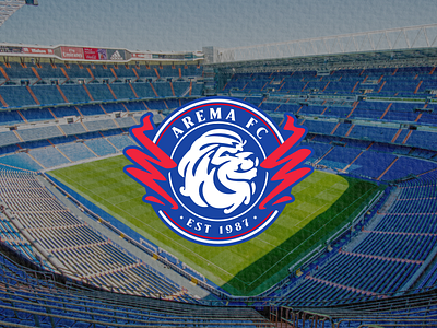
I made a redesign of this logo initially because I saw from the original club logo that it was less attractive for a big team like AREMA FC. therefore I tried to redesign the logo with a focus on changing the lion and fire symbols on the right and left of the lion. Besides that, I also changed the color a little brighter than the original logo and still maintains the original color of the logo. personally, I like the design concept that I have made because I made it by specifying several points that should be changed from the original logo, what do you think? does this suit your taste too or are there any shortcomings in my logo redesign this time? I really appreciate your feedback.
Are you in need of a logo ReDesign?
Feel free to reach out via Dm or eMail:


